


How Lineup Posters Shaped Rave Culture
How rave lineup posters became a defining part of dance music culture, shaping the identity of clubs, festivals and scenes.

There’s a secret language hidden in rave flyers, and if you’re reading this, you probably already understand it. Through colour, typography and imagery, dance music scenes have spent decades building visual languages as distinctive as the music itself. Jungle looks different from techno, techno looks different from house, and house looks different from UK garage. Anyone who’s spent enough time around dance music can tell the difference at a glance, even if they couldn’t explain exactly why.
It all started in the Summer of Love’s acid house flyers, often inspired by late 60s psychedelic media, and they developed their style largely due to the conditions they were created under. The illegal nature and low budgets led to simple, often monochrome designs that were vague on purpose; if you couldn’t understand what they were advertising to you, it’s because you weren’t meant to. The crackdown on illegal parties in the late 80s and early 90s then splintered the rave community, and with increasing popularity, bigger budgets and easier access to digital photo editing software, individual communities and promoters began to create and build their own audio and visual personality.
Music journalist and professor Martin James said, “We were already thinking in terms of brand and branding before we knew what branding was.” Mentioning Cream as a notable example. They created a look that went much further than the rave flyer itself. Their sleek and futuristic aesthetic spread from posters to club decoration and then onto their own label releases, creating a deep immersive experience unlike anything that had come before. Born from a community of people who consumed and created culture all within the same ecosystem; artists, designers, DJs and producers working together to create a unified identity.
A community’s visual identity now became a tool with which to establish itself. As UKG started picking up traction it took a step away from the gritty, chaotic look of earlier genres such as jungle in favour of a more sleek, designer and almost up-market aesthetic. The focus shifted from hiding information from the authorities to communicating with the right audience. If you were part of a community, a single look at a club flyer could tell you exactly what genre was going to be played that night, whether it’d be jungle, techno, house or UKG. Which is pretty remarkable.
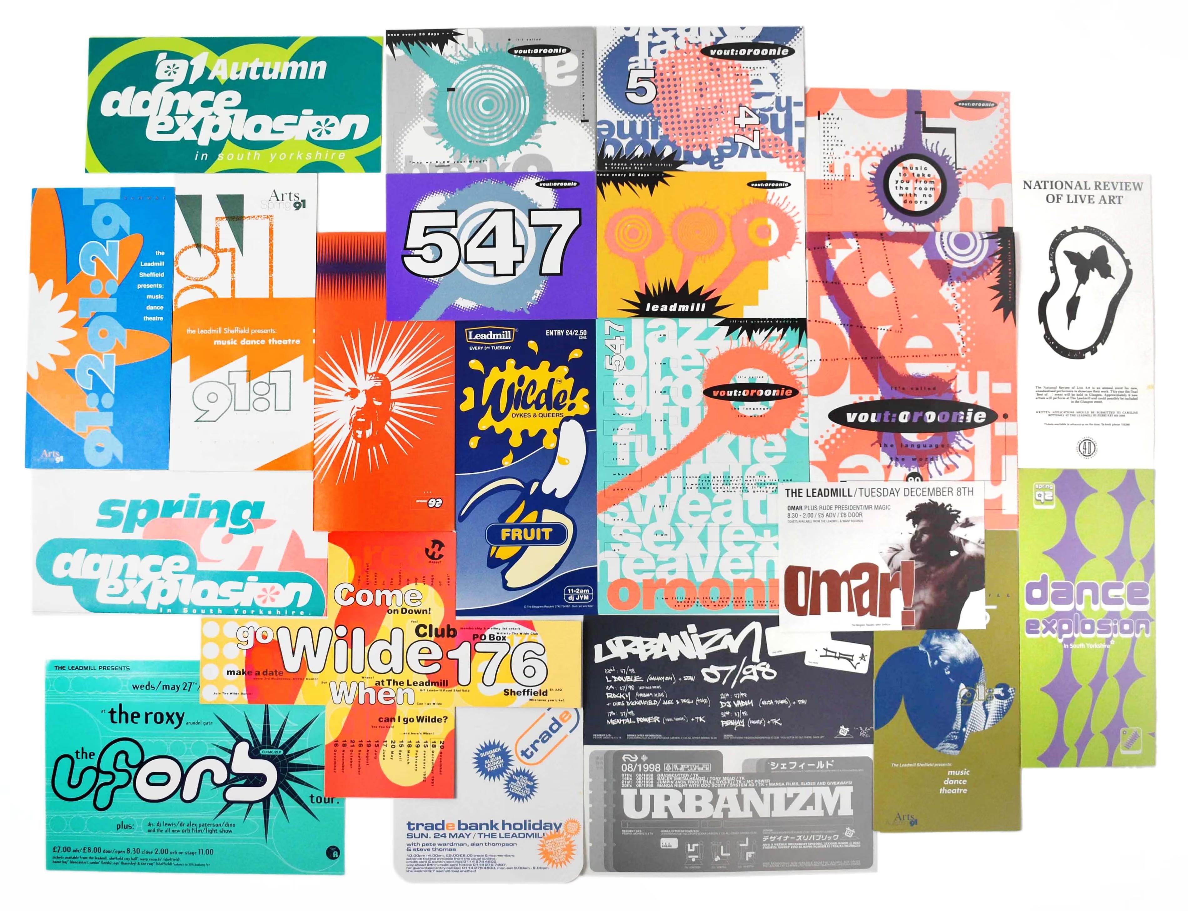
Sheffield’s “Designers Republic” studio
As time progressed and we stepped into the new millennium, rave culture began to find a more permanent footing in the mainstream. Its influence was undeniable. Flyers were now just the tip of the iceberg. The aesthetics developed in clubs and on record sleeves began leaking into wider youth culture. The bright colours and graphic experimentation of rave found their way into fashion, merchandise and branding. Long before music labels became lifestyle brands, rave culture understood that graphics, fashion and music were all part of the same identity. Sheffield’s “Designers Republic” studio was one of the first breakout successes for visual artists in the rave scene. After starting with flyers, they quickly went on to work on campaigns for massive artists like Pulp and Aphex twin. Simply going for a walk around London will quickly show you the deep influence they had on culture. Over-sized typography, bold blocks of colour and densely packed graphic elements are all commonplace in posters, fashion and advertisement; largely due to them.

The influence of these visual languages is definitely still apparent today. A contemporary example is Up Ya Archives, the label founded by jungle revivalist Nia Archives. The artwork retains many of the characteristics that defined classic jungle flyers: saturated colour palettes, crowded compositions and a sense of playful excess. Yet rather than simply recreating 90s aesthetics, it reinterprets them for a new audience, proving that the visual language developed decades ago is still evolving.
Graphic design has always been about more than simply advertising a night out. Every poster, flyer and album cover contributes to a wider visual language that helps define a scene. Before hearing a DJ, buying a record or stepping inside a club, audiences (consciously or subconsciously) encounter the colours, typography and imagery that surround it. Those visual cues tell people who a night is for, what kind of atmosphere to expect and where they belong within a wider community.
Technology may have changed and flyers may now live on Instagram rather than being handed out outside record shops, but their purpose remains remarkably similar. From acid house to jungle, from Cream to Up Ya Archives, UK dance music has always communicated through both sound and image. Every new genre creates not only a new sound, but a new visual language. And eventually, every scene learns to look the way it sounds.
📝: Felix Wiseman
Share this post
Related articles


© breakthewire 2026.